Charts built for you.
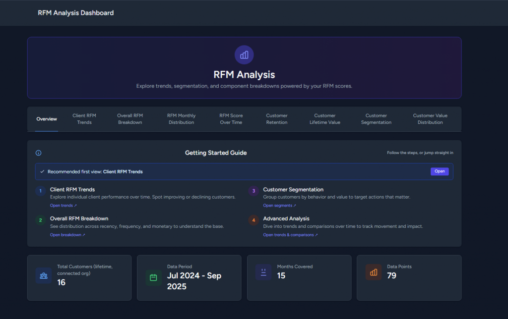
Every plan comes with eight ready-to-use charts that explain your customer behaviour at a glance—trends, R/F/M breakdowns, retention, CLV, and more.
Need something specific?
Sign up with Pro+ to request custom charts tailored to your data and workflow.
We will scope, design, and build it with you.
Client RFM Trends
This line chart shows how each selected client’s RFM score changes over time. Rising lines mean customers are buying more recently/frequently or spending more; dips flag churn risk.
Use the date presets (6M/12M/24M) and Top-N filter or Advanced Selection to focus the comparison.
Overall RFM Trends
Client RFM Trends tracks how each client’s RFM score moves over time. Rising lines mean healthier recency, frequency, or spend, while dips point to churn risk. Overall RFM Trends shows the average Recency, Frequency, and Monetary scores for your customer base so you can see seasonality and campaign impact. Use the 6M, 12M, or 24M presets and the Top-N or Advanced Selection controls to focus the comparison.
+ Many more different graphs